Introduction to fSuSiE
William R.P. Denault
2024-06-28
Source:vignettes/introduction.Rmd
introduction.RmdfSuSiE
In this package, we implement a Bayesian variable selection method called the “Functional Sum of Single Effects” ({}) model that extends the {} model of Wang et al.1 to functional phenotypes that can span over large genomic regions. The methods implemented here are particularly well-suited to settings where some of the X variables are highly correlated, and the true effects are highly sparse (e.g., <20 non-zero effects in the vector b). One example of this is genetic fine-mapping molecular measurements from sequencing assays (ChIP-seq, ATAC-seq ), as well as DNA methylation. However, the methods should also be useful more generally (e.g., detecting changes in time series).
###Model Description
fSuSiE fits the following linear regression \({Y} = {XB} + {E}\), where \({Y}\) is a N x T matrix containing the observed curves, \({X}\) is the N × p matrix of single nucleotide polymorphisms (SNP) in the region to be fine-mapped. \({B}\) is a p × T matrix whose element \(b_{jt}\) is the effect of SNP \(j\) on the trait at location t, and \({E}\) is a matrix of error terms which initially, we consider being normally-distributed with variance \(\sigma^2\). Analogous to regular fine-mapping, the matrix \({B}\) is expected to be sparse, i.e., most rows will be zero. Non-zero rows correspond to SNPs that do affect the trait. The goal is to identify the non-zero rows of \({B}\). We extended {} to functional traits by writing \({B}= \sum_l^L {B}^{(l)}\), where each “single-effect” matrix \({B}^{(l)}\) has only one non-zero row, corresponding to a single causal SNP. We devised a fast variational inference procedure~ for fitting this model by first projecting the data in the wavelet space and then using an adaptation of the efficient iterative Bayesian stepwise selection (IBSS) approach proposed by Wang and colleagues.
The output of the fitting procedure is a number of “Credible Sets” (CSs), which are each designed to have a high probability of containing a variable with a non-zero effect while at the same time being as small as possible. You can think of the CSs as being a set of “highly correlated” variables that are each associated with the response: you can be confident that one of the variables has a non-zero coefficient, but they are too correlated to be sure which one.
The package is developed by William R.P. Denault from the Stephens Lab at the University of Chicago.
Please post issues to ask questions, get our support, or provide us feedback: please send pull requests if you have helped fix bugs or make improvements to the source code.
Using fSuSiE
the data
This vignette shows how to use fsusieR in the context of genetic fine-mapping. We use simulated data of a molecular trait over a region of 124 base pairs (Y) with N≈600 individuals. We want to identify which columns of the genotype matrix X (P=1000) cause changes in expression level.
The simulated data set is simulated to have exactly two non-zero effects.
Here, we simulate the effects
knitr::opts_chunk$set(
    echo = TRUE,
    message = FALSE,
    warning = FALSE
)
library(fsusieR)
library(susieR)
library(wavethresh)
#> Loading required package: MASS
#> WaveThresh: R wavelet software, release 4.7.2, installed
#> Copyright Guy Nason and others 1993-2022
#> Note: nlevels has been renamed to nlevelsWT
set.seed(1)
data(N3finemapping)
attach(N3finemapping)

rsnr <- 0.5 #expected root signal noise ratio

pos1 <- 25    #Position of the causal covariate for effect 1
pos2 <- 75    #Position of the causal covariate for effect 2
lev_res <- 7#length of the molecular phenotype (2^lev_res)
f1 <-  simu_IBSS_per_level(lev_res )$sim_func#first effect
f2 <- simu_IBSS_per_level(lev_res )$sim_func #second effect

plot( f1, type ="l", ylab="effect", col="blue")
abline(a=0,b=0)
lines(f2, type="l", col="green")
legend(x=100,
       y=3,
       lty = rep(1,3),
      legend= c("effect 1", "effect 2" ),
       col=c( "blue","green"))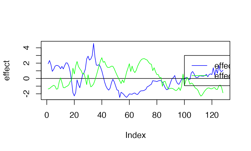
So, the underlying causal variants are variant 25 and variant 75. The plot above shows the functional effect of the two variants. Below, we generate the observed curves (effect +noise)
Output and interpretation
Running fSuSiE requires a Y matrix in which each line corresponds to an individual profile/time series. X the genotype matrix in which each line represents the individual genotype and the column the different SNPs. L is an upper bound on the number of causal SNPs within the regions (we advise keeping this parameter below 20).
 out <- susiF(Y,X,L=10)
#> [1] "Starting initialization"
#> [1] "Data transform"
#> [1] "Discarding  0 wavelet coefficients out of  128"
#> [1] "Data transform done"
#> [1] "Initializing prior"
#> [1] "Initialization done"
#> [1] "Fitting effect  1 , iter 1"
#> [1] "Fitting effect  2 , iter 1"
#> [1] "Fitting effect  3 , iter 1"
#> [1] "Discarding  1  effects"
#> [1] "Fitting effect  1 , iter 2"
#> [1] "Fitting effect  2 , iter 2"
#> [1] "Discarding  8  effects"
#> [1] "Greedy search and backfitting done"
#> [1] "Fitting effect  1 , iter 3"
#> [1] "Fitting effect  2 , iter 3"
#> [1] "Fine mapping done, refining effect estimates using cylce spinning wavelet transform"
FSuSiE automatically selects the number of causal effects (here two). The effects detected are summarized in terms of credible sets. Each credible set contains the likely causal covariates for a given effect. You can access them simply as
out$cs
#> [[1]]
#> [1] 75 83
#>
#> [[2]]
#> [1] 25
As you can see, the two CSs contain the correct causal SNPs.
Visualization
The easiest way to visualize the result is to use the function.
plot_susiF(out )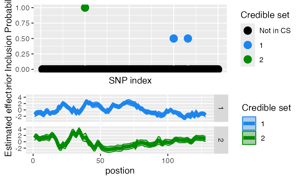
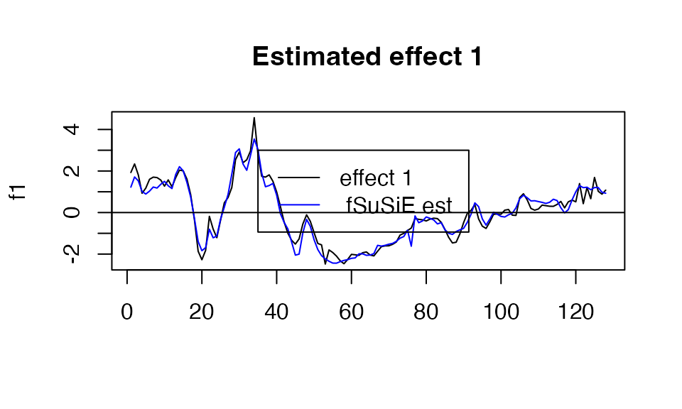
You can also access the information directly in the output of susiF in the fitted_func part of the output. See below
 plot( f1, type="l", main="Estimated effect 1", xlab="")
 lines(get_fitted_effect(out,l=2),col='blue' )
 abline(a=0,b=0)
 legend(x= 35,
        y=3,
        lty= rep(1,2),
        legend = c("effect 1"," fSuSiE est "),
        col=c("black","blue" )
 )
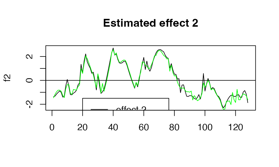
 plot( f2, type="l", main="Estimated effect 2", xlab="")
 lines(get_fitted_effect(out,l=1),col='green' )
 abline(a=0,b=0)
 legend(x= 20,
        y=-1.5,
        lty= rep(1,2),
        legend = c("effect 2"," fSuSiE est "),
        col=c("black","green" )
 )
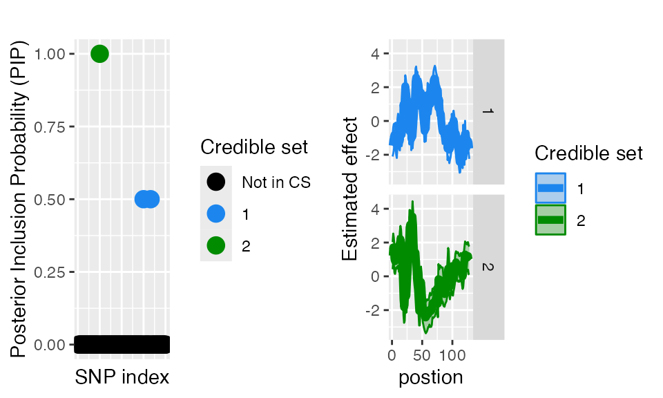
####Posterior inclusion probabilities You can also access the Posterior inclusion probabilities directly from the fitted object. Similarly, you can specify the plot_susiF function to display only the PiP plot.
out$pip[1:10]
#>  [1] 0 0 0 0 0 0 0 0 0 0

plot_susiF(out, pip_only=TRUE)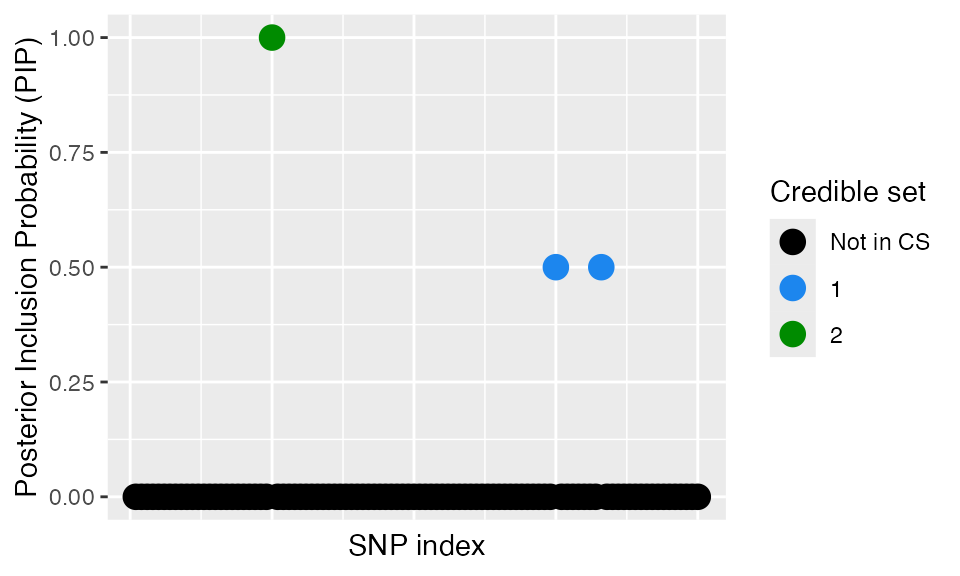
Extracting the regions affected by the credible sets
We provide a build-in function to retrieve the regions where the credible bands are “crossing zero”/i.e., the effects are likely not to be 0 in this region.
 affected_reg( out)
#>    CS Start End
#> 1   1     1   8
#> 2   1    12  16
#> 8   1    19  19
#> 9   1    21  26
#> 3   1    32  32
#> 4   1    34  34
#> 10  1    38  50
#> 11  1    59  78
#> 5   1    86  98
#> 6   1   104 120
#> 7   1   122 128
#> 17  2     1  16
#> 12  2    19  21
#> 13  2    23  24
#> 18  2    28  39
#> 14  2    44  47
#> 15  2    50  76
#> 16  2    86  90
#> 19  2   106 107
#> 20  2   120 128
Prediction
You can also check the predictive power of susiF by checking the fitted from the output susiF
true_sig  <- matrix( X[ ,pos1], ncol=1)%*%t(f1_obs) +matrix( X[ ,pos2], ncol=1)%*%t(f2_obs)


plot(out$ind_fitted_func,  true_sig,
     xlab= "predicted value", ylab="true value")
abline(a=0,b=1)
Note that these predictions can differ substantially from the observed noisy curves
plot(out$ind_fitted_func,  Y,
     xlab= "predicted value", ylab="Noisy observation value")
abline(a=0,b=1)
Handling function of any length and unevenly space data
Wavelets are primarily designed to analyze functions sampled on \(2^J\) evenly spaced positions. However,
this assumption is unrealistic in practice. For handling functions of
any length, we use the approach of Kovac and Silvermann (2005), which
basically remaps the data on a grid of length \(2^J\).
* if you don’t provide the sampling position (e.g., base pair
measurement) in the pos argument, susiF considers that the columns of Y
correspond to evenly spaced sampling positions. For example, when
fine-mapping DNA methylation (DNAm) data, if you are trying to fine-map
meQTL, the columns of the Y matrix correspond to different CpG . You
provide the genomic position of each of these CpG as a vector in the
“pos” argument in the susiF function.
- susiF provides the estimated effect on the remapped effect on a \(2^J\) grid.
Example of how to analyze unevenly spaced data. The black lines corresponds to one of the SNP effect in our data, the red ticks corresponds to the sampling positions and the red dots correspond to what part of the effect we can observe.
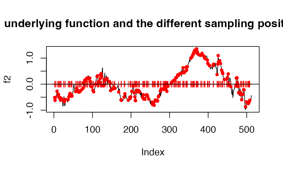
Let’s generate the data under these conditions
  f1_obs <- f1[sampling_pos]
  f2_obs <- f2[sampling_pos]
noisy.data  <- list()
X <- N3finemapping$X[,1:100]
for ( i in 1:nrow(X))
{

  noise <- rnorm(length(f1_obs ), sd=  2)
  noisy.data [[i]] <-  X[i,pos1]*f1_obs +X[i,pos2]*f2_obs + noise

}
noisy.data <- do.call(rbind, noisy.data)

Y <- noisy.data
To account for it, pass the sampling position in the pos argument.
 out <- susiF(Y,X,L=3 ,pos= sampling_pos)
#> [1] "Starting initialization"
#> [1] "Data transform"
#> [1] "Discarding  0 wavelet coefficients out of  256"
#> [1] "Data transform done"
#> [1] "Initializing prior"
#> [1] "Initialization done"
#> [1] "Fitting effect  1 , iter 1"
#> [1] "Fitting effect  2 , iter 1"
#> [1] "Fitting effect  3 , iter 1"
#> [1] "Discarding  1  effects"
#> [1] "Fitting effect  1 , iter 2"
#> [1] "Fitting effect  2 , iter 2"
#> [1] "Discarding  1  effects"
#> [1] "Greedy search and backfitting done"
#> [1] "Fitting effect  1 , iter 3"
#> [1] "Fitting effect  2 , iter 3"
#> [1] "Fine mapping done, refining effect estimates using cylce spinning wavelet transform"
To visualize the estimated effect with the correct x coordinate, use the “$outing_grid” object from the susiF.obj
In this example, effect 2 (in our simulation) is captured in the first CS. The black line is the actual true effect. The red dots are the effect level at the sampling position, the thick blue line is the estimated effect, and the dashed line is the 95% credible bands.
plot(   x=1:512,           y=f2,type="l")
points( x=sampling_pos,    y=f2_obs, col="red",pch=20)
lines(  x=out$outing_grid, y=out$fitted_func[[1]]    ,col='darkblue', lwd=2)
lines(  x=out$outing_grid, y= out$cred_band[[1]][1,] ,col='darkblue',lty=2 )
lines(  x=out$outing_grid, y= out$cred_band[[1]][2,] ,col='darkblue' ,lty=2 )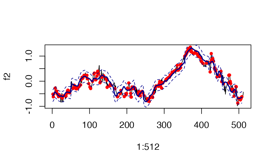
A note on the priors available
Note that fSuSiE has two different priors available: and . The default value is , which has slightly higher performance (power, estimation accuracy) than the . However, is up to 40% faster than the . You may consider using this option before performing genome-wide fine mapping.
Here is a comparison between their running time
 out1 <- susiF(Y,X,L=3 , prior = 'mixture_normal_per_scale',verbose=FALSE)
#> [1] "Fine mapping done, refining effect estimates using cylce spinning wavelet transform"
 out1$runtime
#>    user  system elapsed
#>   6.285   0.317   6.641
 out2 <- susiF(Y,X,L=3 , prior = 'mixture_normal',verbose=FALSE)
#> [1] "Fine mapping done, refining effect estimates using cylce spinning wavelet transform"
 out2$runtime
#>    user  system elapsed
#>   2.377   0.123   2.515