Key ideas for molecular profile QTL fine-mapping with applications to DNAm QTL
William Denault and Peter Carbonetto
2026-05-13
Source:vignettes/methyl_demo.Rmd
methyl_demo.RmdIn this vignette we illustrate some of the key ideas underlying fSuSiE by applying fSuSiE to analyze a toy methylation data set.
Load the packages used in this vignette.
library(susieR)
library(fsusieR)
#
# Attaching package: 'fsusieR'
# The following object is masked from 'package:susieR':
#
#     get_objective
library(reshape2)
library(ggplot2)
library(cowplot)
Set the seed so that the results can be reproduced.
set.seed(1)Simulate data
We simulate a “toy” methylation data set in which the methylation levels of 100 individuals are measured at 32 CpGs.
Among the 12 candidate SNPs, 3 SNPs affect the methylation levels: 2 SNPs affect the methylation levels of the same cluster of 8 CpGs, and the other SNP affects the methylation levels of different cluster of 8 CpGs.
n <- 100
m <- 32
p <- 12
Generate the SNP minor allele frequencies (MAFs):
maf <- 0.05 + 0.45*runif(p)Generate ids for SNPs and CpGs.
Simulate the genotypes:
X <- (runif(n*p) < maf) +
     (runif(n*p) < maf)
X <- matrix(X,n,p,byrow = TRUE)
storage.mode(X) <- "double"
X[,4] <- X[,3] + 0.03*rnorm(n)
colnames(X) <- snpids
This is the matrix that determines how the SNP alleles change the methylation levels.
F <- matrix(0,p,m)
F[1,9:16] <- 2.3
F[9,9:16] <- (-2.3)
F[3,25:32] <- 2
rownames(F) <- snpids
colnames(F) <- cpgids
Simulate the methylation levels at the CpGs:
To make the example more realistic, the methylation levels are all simulated to be zero or higher.
To illustrate, this plot shows the effect of SNP 3 on the methylation levels. The points show what the data look like and the lines show the mean methylation levels for the three SNP genotypes:
pdat <- melt(Y)
x    <- X[,3]
pdat <- data.frame(cpg        = rep(1:m,each = n) +
                                runif(m*n,min = -0.2,max = 0.2),
                   meth_level = as.vector(Y),
                   geno       = factor(x))
pdat_lines <- data.frame(cpg = rep(1:m,times = 3),
                         geno = factor(rep(0:2,each = m)),
                         meth_level = rep(c(rep(0,8),rep(-0.75,8),rep(0,16)),
                                          times = 3))
pdat_lines$meth_level <- pdat_lines$meth_level - baseline
rows <- which(with(pdat_lines,geno == 1 & cpg > 24))
pdat_lines[rows,"meth_level"] <- pdat_lines[rows,"meth_level"] + 2
rows <- which(with(pdat_lines,geno == 2 & cpg > 24))
pdat_lines[rows,"meth_level"] <- pdat_lines[rows,"meth_level"] + 4
p1 <- ggplot(pdat, aes(x = cpg, y = meth_level, color = geno)) +
  geom_point(shape = 20, size = 1.25) +
  scale_x_continuous(breaks = c(0, seq(4, 32, 4))) +
  scale_color_manual(values = c("darkblue", "limegreen", "darkorange")) +
  geom_line(data = pdat_lines, aes(x = cpg, y = meth_level, group = geno),
            color = "black", linewidth = 1.9) +  # Black line for contrast
  geom_line(data = pdat_lines, linewidth = 1.25) +  # Original colored lines
  labs(x = "CpG", y = "methylation level", color = "genotype") +
  theme_cowplot(font_size = 11)
print(p1)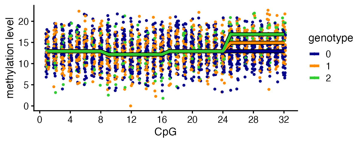
QTL mapping
Let’s first consider performing association tests for all the CpG-SNP
pairs, which is one approach to mapping methylation QTLs. Here we will
simply use the standard linear regression function in R,
lm(), to perform the QTL mapping.
assoc <- matrix(0,m,p)
rownames(assoc) <- cpgids
colnames(assoc) <- snpids
for (i in 1:m) {
  for (j in 1:p) {
    dat <- data.frame(x = X[,j],y = Y[,i])
    fit <- lm(y ~ x,dat)
    assoc[i,j] <- summary(fit)$coefficients["x","Pr(>|t|)"]
  }
}
Having performed these tests for association, we can examine the associations in two different ways, by SNP and by CpG site. Let’s start with the SNP-centered view:
pdat <- data.frame(cpg    = rep(1:m,times = p),
                   snp    = rep(1:p,each = m),
                   effect = as.vector(t(F != 0)),
                   pval   = as.vector(assoc))
pdat <- transform(pdat,pval = -log10(pval))
threshold <- -log10(0.05/(m*p))
p2 <- ggplot(pdat,aes(x = snp,y = pval,shape = effect,color = effect)) +
  geom_point(size = 1.5) +
  geom_hline(yintercept = threshold,color = "black",linetype = "dotted") +
  scale_x_continuous(breaks = 1:p) +
  scale_shape_manual(values = c(1,4)) +
  scale_color_manual(values = c("darkblue","darkorange")) +
  labs(x = "SNP",y = "-log10 p-value") +
  theme_cowplot(font_size = 11)
print(p2)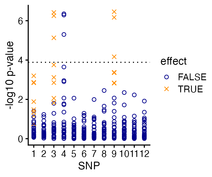
Based on these simple association tests, we would identify two out of the three causal SNPs. (And perhaps we would identify all three causal SNPs if we were a bit more careful about multiple testing correction—here we just used the basic Bonferroni correction, which tells us that only the CpG-SNPs pairs with p-values less than 0.0001 are significant.)
But more importantly, this view alone doesn’t tell us which CPGs are affected by the SNPs.
This is the CpG-centered view:
p3 <- ggplot(pdat,aes(x = cpg,y = pval,shape = effect,color = effect)) +
  geom_point(size = 1.5) +
  geom_hline(yintercept = threshold,linetype = "dotted") +
  scale_x_continuous(breaks = c(0,seq(4,32,4))) +
  scale_shape_manual(values = c(1,4)) +
  scale_color_manual(values = c("darkblue","darkorange")) +
  labs(x = "CpG",y = "-log10 p-value") +
  theme_cowplot(font_size = 11)
print(p3)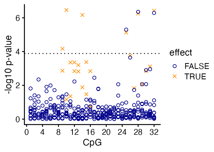
From the association test p-values alone it is quite clear that the affected CpG sites “cluster” in two continuous regions, but it is less clear exactly which CpG sites in these clusters are affected.
But more importantly, this view alone doesn’t tell us which SNPs are affecting the changes in the methylation levels at these CpGs.
Fine-mapping with SuSiE
Let’s now consider how one might analyze these data using a standard (univariate phenotype) fine-mapping method, SuSiE, and then we will point out its limitations and contrast it with fSuSiE.
One possible approach is a two-stage approach where we: (i) identify the associated CpGs (using the results of the association analysis above); then (ii) perform fine-mapping separately for each of the associated CpGs. This is the approach we will try here.
assoc_cpgs <- subset(pdat,pval > threshold)$cpg
assoc_cpgs <- sort(unique(assoc_cpgs))
assoc_cpgs <- paste0("CpG-",assoc_cpgs)
assoc_cpgs
# [1] "CpG-9"  "CpG-10" "CpG-14" "CpG-25" "CpG-28" "CpG-32"
Having identified the 6 associated CpGs, we now run SuSiE separately for each of them:
num_cpgs <- length(assoc_cpgs)
susie_fits <- vector("list",num_cpgs)
names(susie_fits) <- assoc_cpgs
for (i in assoc_cpgs)
  susie_fits[[i]] <- susie(X,Y[,i],L = 3)
This plot shows the 6 fine-mapping “signals” (the PIPs). For convenience, the two CpG “clusters” are colored red and blue.
pdat <- rbind(data.frame(cpg = 9, snp = 1:p,pip = susie_fits[["CpG-9"]]$pip),
              data.frame(cpg = 10,snp = 1:p,pip = susie_fits[["CpG-10"]]$pip),
              data.frame(cpg = 14,snp = 1:p,pip = susie_fits[["CpG-14"]]$pip),
              data.frame(cpg = 25,snp = 1:p,pip = susie_fits[["CpG-25"]]$pip),
              data.frame(cpg = 28,snp = 1:p,pip = susie_fits[["CpG-28"]]$pip),
              data.frame(cpg = 32,snp = 1:p,pip = susie_fits[["CpG-32"]]$pip))
p5 <- ggplot(pdat,
       aes(x = snp,y = pip,color = factor(cpg),shape = factor(cpg))) +
  geom_point() +
  scale_color_manual(values = c(rep("red",3),rep("darkblue",3))) +
  scale_shape_manual(values = c(1,20,4,1,20,4)) +
  scale_x_continuous(breaks = 1:12) +
  scale_y_continuous(breaks = c(0,0.5,1)) +
  labs(x = "SNP",y = "PIP",color = "CpG",shape = "CpG") +
  theme_cowplot(font_size = 10)
p5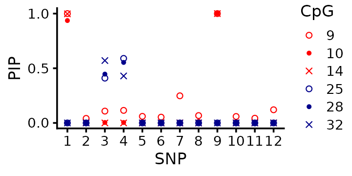
One takeaway is that it is difficult to interpret these results because we have 6 fine-mapping signals. fSuSiE, by contrast, is much easier to interpret result because it produces just a single fine-mapping signal.
Upon closer examination, some of the fine-mapping signals agree very well; for example, SNP 1 is identified as a causal SNP for CpGs 9, 10 and 14 (the red cluster) with a PIP near 1, strongly suggesting that SNP 1 has an effect on the methylation at all these CpGs. However, the fine-mapping signal at SNPs 3 and 4 is a little harder to interpret: one signal (CpG 32) prefers SNP 3, whereas the others prefer SNP 4. More generally, it is an open question how to integrate these signals from the separate SuSiE analyses.
Additionally, and perhaps more critically, SuSiE does not directly tell us which CpGs are affected by each causal SNP. By contrast, fSuSiE will be able to answer this question.
Fine-mapping with fSuSiE
Let’s now contrast the QTL mapping and SuSiE analyses with an analysis of the methylation data using fSuSiE. First we fit the fSuSiE model to the data. Notice that we only a fit a single model to all the data:
fit <- susiF(Y,X,L = 3,filter_cs = FALSE,prior = "mixture_normal",
             post_processing = "HMM")
(In this example it is assumed that we know that there are three causal SNPs, but more generally this number can be estimated.)
fSuSiE correctly produced 3 credible sets (95% CSs) each containing one of the causal SNPs:
fit$cs
# [[1]]
# SNP-9
#     9
#
# [[2]]
# SNP-3 SNP-4
#     3     4
#
# [[3]]
# SNP-1
#     1
This result can be visualized using a “PIP plot” (PIP = posterior inclusion probability):
cs_colors <- c("dodgerblue","darkorange","red")
pdat <- data.frame(SNP = 1:p,
                   PIP = fit$pip,
                   CS  = rep("none",p))
pdat$CS[fit$cs[[1]]] <- "L1"
pdat$CS[fit$cs[[2]]] <- "L2"
pdat$CS[fit$cs[[3]]] <- "L3"
pdat <- transform(pdat,CS = factor(CS))
p4 <- ggplot(pdat,aes(x = SNP,y = PIP,fill = CS)) +
  geom_point(shape = 21,size = 2,color = "white") +
  scale_x_continuous(breaks = 1:p) +
  scale_fill_manual(values = c(cs_colors,"gray")) +
  theme_cowplot(font_size = 10)
print(p4)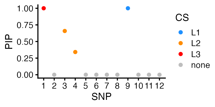
Again, fSuSiE very confidently identified the correct three causal SNPs, whereas this was not the case in the QTL mapping. The key difference is that fSuSiE fits a single model to all the data.
fSuSiE also gives a more coherent view of changes to the CpG sites
and how they are affected by the individual causal SNPs (or, more
precisely, by the individual CSs). Here we use the lfsr
(local false sign rate) estimates produced by the HMM (using
the post_processing = "HMM" option):
i <- sapply(fit$cs,function (x) intersect(x,c(1,3,9)))
pdat <- data.frame(CS   = rep(c("L1","L2","L3"),each = m),
                   CpG  = rep(1:m,times = 3),
                   lfsr = unlist(fit$lfsr_func),
                   affected = as.vector(t(F[i,]) != 0),
                   stringsAsFactors = FALSE)
pdat <- transform(pdat,
                  CS   = factor(CS,c("L3","L2","L1")),
                  lfsr = -log10(lfsr))
ggplot(pdat,aes(x = CpG,y = CS,size = lfsr,color = affected)) +
  geom_point(shape = 1) +
  scale_x_continuous(breaks = c(0,seq(4,32,4))) +
  scale_color_manual(values = c("darkblue","darkorange")) +
  scale_size(range = c(0.5,10),breaks = c(1.3,5,10)) +
  labs(size = "-log10(lfsr)") +
  theme_cowplot(font_size = 10)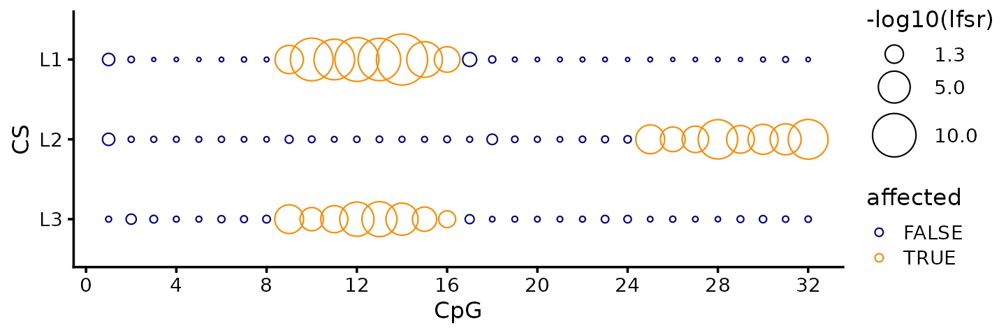
Indeed, the significance tests (local false sign rate) break down the support for affected CpGs separately for each CS (i.e., for each causal SNP), and therefore it is quite evident from the fSuSiE results that two of the causal SNPs affect the same CpG cluster, and the other causal SNP affects a different CpG cluster.
The lfsrs quantify the support the CpG sites being affected, and in this example the CpG sites with the smallest lfsrs (largest circles in the plot) are indeed the affected CpGs.
TI wavelet estimates
An alternative to the HMM post-processing step is to use the TI (“translation invariant”) wavelets to estimate the effects and their credible bands:
fit_TI <- susiF(Y,X,L = 3,filter_cs = FALSE,prior = "mixture_normal" )Note that the post-processing step doesn’t change the CSs (nor the PIPs), only the estimated effects of the SNPs on the CpGs.
range(fit$pip - fit_TI$pip)
fit_TI$cs
# [1] 0 0
# [[1]]
# SNP-9
#     9
#
# [[2]]
# SNP-3 SNP-4
#     3     4
#
# [[3]]
# SNP-1
#     1
These are the TI wavelet estimates of the effects on the CpG sites (and corresponding 95% credible bands):
out <- lapply(1:3,function (i) get_fitted_effect(fit_TI,l = i,cred_band = TRUE,
                                                 alpha = 0.05))
effect_plot <- function (i) {
  pdat <- data.frame(cpg      = 1:m,
                     estimate = out[[i]]$effect,
                     lower    = out[[i]]$cred_band["low",],
                     upper    = out[[i]]$cred_band["up",])
  rows <- with(pdat,which(lower > 0 | upper < 0))
  pdat2 <- data.frame(cpg = rows,estimate = 0)
  return(ggplot(pdat,aes(x = cpg,y = estimate,ymin = lower,ymax = upper)) +
         geom_point(color = cs_colors[i],size = 1) +
         geom_errorbar(color = cs_colors[i],linewidth = 0.4) +
         geom_hline(yintercept = 0,color = "black",linewidth = 0.4) +
         geom_point(data = pdat2,mapping = aes(x = cpg,y = estimate),
                    shape = 20,color = "black",size = 1.5,
                    inherit.aes = FALSE) +
         scale_x_continuous(breaks = c(0,seq(4,32,4))) +
         labs(x = "CpG",y = "change",title = paste0("CS",i)) +
         theme_cowplot(font_size = 11))
}
plot_grid(effect_plot(1),
          effect_plot(2),
          effect_plot(3),
          nrow = 3,ncol = 1)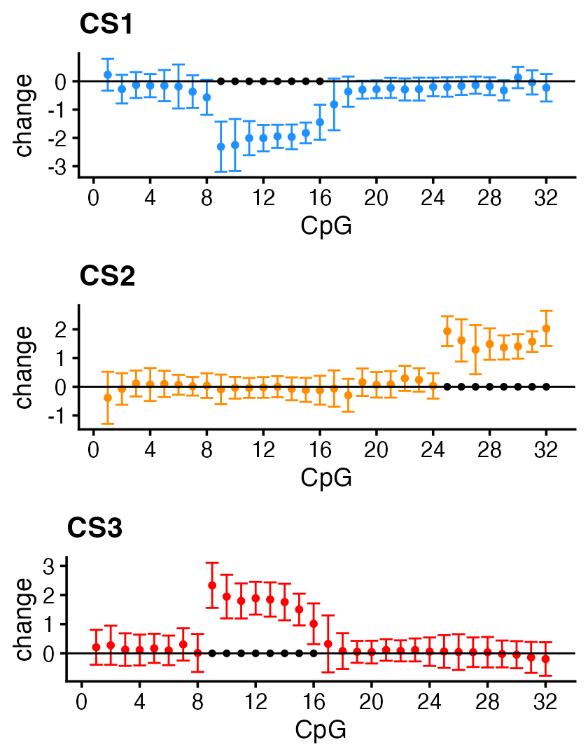
The effect estimates with 95% credible bands outside zero predict very accurately the affected CpG sites.
Session info
This is the version of R and the packages that were used to generate these results.
sessionInfo()
# R version 4.4.3 (2025-02-28)
# Platform: x86_64-conda-linux-gnu
# Running under: Ubuntu 24.04.4 LTS
#
# Matrix products: default
# BLAS/LAPACK: /home/runner/work/fsusieR/fsusieR/.pixi/envs/r44/lib/libopenblasp-r0.3.33.so;  LAPACK version 3.12.0
#
# locale:
#  [1] LC_CTYPE=C.UTF-8       LC_NUMERIC=C           LC_TIME=C.UTF-8
#  [4] LC_COLLATE=C.UTF-8     LC_MONETARY=C.UTF-8    LC_MESSAGES=C.UTF-8
#  [7] LC_PAPER=C.UTF-8       LC_NAME=C              LC_ADDRESS=C
# [10] LC_TELEPHONE=C         LC_MEASUREMENT=C.UTF-8 LC_IDENTIFICATION=C
#
# time zone: Etc/UTC
# tzcode source: system (glibc)
#
# attached base packages:
# [1] stats     graphics  grDevices utils     datasets  methods   base
#
# other attached packages:
# [1] cowplot_1.2.0  ggplot2_4.0.3  reshape2_1.4.5 fsusieR_0.3.54 susieR_0.16.1
#
# loaded via a namespace (and not attached):
#  [1] sass_0.4.10           generics_0.1.4        bitops_1.0-9
#  [4] smashr_1.2-7          ashr_2.2-63           stringi_1.8.7
#  [7] lattice_0.22-9        caTools_1.18.3        digest_0.6.39
# [10] magrittr_2.0.5        evaluate_1.0.5        grid_4.4.3
# [13] RColorBrewer_1.1-3    fastmap_1.2.0         plyr_1.8.9
# [16] jsonlite_2.0.0        Matrix_1.7-5          reshape_0.8.10
# [19] mixsqp_0.3-54         scales_1.4.0          truncnorm_1.0-9
# [22] invgamma_1.2          textshaping_1.0.3     jquerylib_0.1.4
# [25] cli_3.6.6             rlang_1.2.0           zigg_0.0.2
# [28] crayon_1.5.3          withr_3.0.2           cachem_1.1.0
# [31] yaml_2.3.12           otel_0.2.0            SQUAREM_2026.1
# [34] tools_4.4.3           dplyr_1.2.1           wavethresh_4.7.3
# [37] Rfast_2.1.5.2         vctrs_0.7.3           R6_2.6.1
# [40] matrixStats_1.5.0     lifecycle_1.0.5       stringr_1.6.0
# [43] fs_2.1.0              htmlwidgets_1.6.4     MASS_7.3-65
# [46] ragg_1.5.2            irlba_2.3.7           pkgconfig_2.0.3
# [49] desc_1.4.3            pkgdown_2.2.0         RcppParallel_5.1.11-2
# [52] bslib_0.10.0          pillar_1.11.1         gtable_0.3.6
# [55] data.table_1.17.8     glue_1.8.1            Rcpp_1.1.1-1.1
# [58] systemfonts_1.3.2     xfun_0.57             tibble_3.3.1
# [61] tidyselect_1.2.1      knitr_1.51            dichromat_2.0-0.1
# [64] farver_2.1.2          htmltools_0.5.9       labeling_0.4.3
# [67] rmarkdown_2.31        compiler_4.4.3        S7_0.2.2