knitr::opts_chunk$set(fig.width = 8, fig.height = 6,comment = "#",
                      collapse = TRUE,results = "hold",
                      fig.align = "center")
library(fashr)
library(ggplot2)
## Warning: package 'ggplot2' was built under R version 4.5.2Overview
Suppose we have sets of eQTLs. The effect size estimate for the th eQTL at time , where , is denoted by . Given the true effect , the observed estimate is assumed to follow where denotes the standard error at time . Let and denote the vectors of effect size estimates and standard errors for the th eQTL, respectively.
The goal of fashr is to perform functional adaptive
shrinkage (FASH) for inferring the posterior distribution of the effect
size function
,
given the observed data
and
.
FASH assumes that all are i.i.d. draws from a common prior . The prior has the form of a finite mixture of Gaussian processes (GPs): Each GP component is specified via the differential equation: if , then where is a Gaussian white noise process and is a known th-order linear differential operator. The standard deviation parameter determines how much can deviate from the base model, defined as the null space .
Given a grid of , the prior mixing weights are estimated by maximizing the marginal likelihood of the observed effect size estimates: where denotes the marginal likelihood of under the th GP component. Based on the estimated prior , the posterior distribution for can be computed as: where is the posterior distribution under the th GP component.
In the following section, we illustrate this with simulated data.
Setup
We consider effect size estimates for eQTLs measured from day to day :
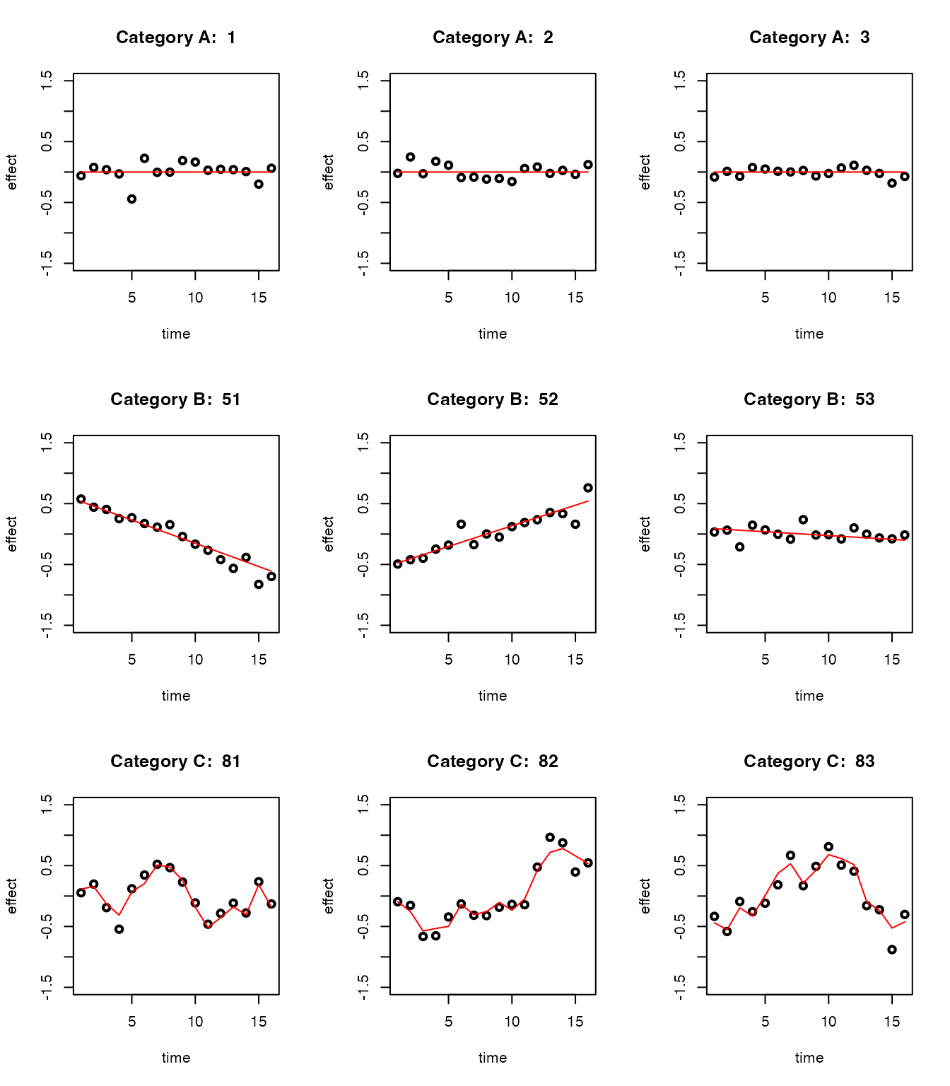
There are 50 eQTLs that are non-dynamic, that is, their effect sizes remain constant over time (Category A).
There are 30 eQTLs with linear dynamics, that is, their effect sizes change linearly over time (Category B).
There are 20 eQTLs with nonlinear dynamics, that is, their effect sizes change nonlinearly over time (Category C).
For each eQTL at each time point, the standard error is randomly drawn from .
set.seed(1)
N <- 100
propA <- 0.5; propB <- 0.3; propC <- 0.2
sigma_vec <- c(0.05, 0.1, 0.2)

sizeA <- N * propA
data_sim_list_A <- lapply(1:sizeA, function(i) simulate_process(sd_poly = 0.2, type = "nondynamic", sd = sigma_vec, normalize = TRUE))

sizeB <- N * propB
if(sizeB > 0){
data_sim_list_B <- lapply(1:sizeB, function(i) simulate_process(sd_poly = 1, type = "linear", sd = sigma_vec, normalize = TRUE))

}else{
  data_sim_list_B <- list()
}

sizeC <- N * propC
data_sim_list_C <- lapply(1:sizeC, function(i) simulate_process(sd_poly = 0, type = "nonlinear", sd = sigma_vec, sd_fun = 1, p = 1, normalize = TRUE))

datasets <- c(data_sim_list_A, data_sim_list_B, data_sim_list_C)
labels <- c(rep("A", sizeA), rep("B", sizeB), rep("C", sizeC))
indices_A <- 1:sizeA
indices_B <- (sizeA + 1):(sizeA + sizeB)
indices_C <- (sizeA + sizeB + 1):(sizeA + sizeB + sizeC)

dataset_labels <- rep(as.character(NA),100)
dataset_labels[indices_A] <- paste0("A",seq(1,length(indices_A)))
dataset_labels[indices_B] <- paste0("B",seq(1,length(indices_B)))
dataset_labels[indices_C] <- paste0("C",seq(1,length(indices_C)))
names(datasets) <- dataset_labels

par(mfrow = c(3, 3))
for(i in indices_A[1:3]){
  plot(datasets[[i]]$x, datasets[[i]]$y, type = "p", col = "black", lwd = 2, xlab = "time", ylab = "effect", ylim = c(-1.5, 1.5), main = paste("Category A: ", i))
  lines(datasets[[i]]$x, datasets[[i]]$truef, col = "red", lwd = 1)
}

for(i in indices_B[1:3]){
  plot(datasets[[i]]$x, datasets[[i]]$y, type = "p", col = "black", lwd = 2, xlab = "time", ylab = "effect", ylim = c(-1.5, 1.5), main = paste("Category B: ", i))
  lines(datasets[[i]]$x, datasets[[i]]$truef, col = "red", lwd = 1)
}

for(i in indices_C[1:3]){
  plot(datasets[[i]]$x, datasets[[i]]$y, type = "p", col = "black", lwd = 2, xlab = "time", ylab = "effect", ylim = c(-1.5, 1.5), main = paste("Category C: ", i))
  lines(datasets[[i]]$x, datasets[[i]]$truef, col = "red", lwd = 1)
}
Let’s take a look at the data structure:
length(datasets)
# [1] 100
This is the first dataset:
datasets[[1]]
#     x            y truef   sd
# 1   1 -0.061077677     0 0.20
# 2   2  0.075589058     0 0.05
# 3   3  0.038984324     0 0.10
# 4   4 -0.031062029     0 0.05
# 5   5 -0.442939977     0 0.20
# 6   6  0.224986184     0 0.20
# 7   7 -0.004493361     0 0.10
# 8   8 -0.001619026     0 0.10
# 9   9  0.188767242     0 0.20
# 10 10  0.164244239     0 0.20
# 11 11  0.029695066     0 0.05
# 12 12  0.045948869     0 0.05
# 13 13  0.039106815     0 0.05
# 14 14  0.007456498     0 0.10
# 15 15 -0.198935170     0 0.10
# 16 16  0.061982575     0 0.10
Take a look at the true label of the datasets:
table(labels)
# labels
#  A  B  C
# 50 30 20
Fitting FASH
The main function for fitting FASH is fash(). By
default, users should provide a list of datasets
(data_list), and specify the column names for the effect
size (Y), its standard deviation (S), and the
time variable (smooth_var).
Computation can be parallelized by specifying the number of cores
(num_cores).
Reducing the number of basis functions (num_basis) can also
improve computational speed.
The function fash() sequentially performs the following
key steps:
-
Compute the likelihood matrix
for each eQTL and each GP component .
-
Estimate the prior mixing weights by maximizing the marginal likelihood:
-
Compute the posterior weights for each eQTL and GP component :
where is the local false discovery rate (lfdr) under the null hypothesis .
Testing Dynamic eQTLs
We will apply FASH to identify dynamic eQTLs, including both linear and nonlinear cases (Categories B and C).
In this case, the base model
represents the space of constant functions. We specify
,
which is a first-order differential operator. This choice corresponds to
the first Integrated Wiener Process (IWP1) model
(order = 1).
fash_fit1 <- fash(Y = "y", smooth_var = "x", S = "sd", data_list = datasets, order = 1)
fash_fit1
This is the output of fash():
fash_fit1
# Fitted fash Object
# -------------------
# Number of datasets: 100
# Likelihood: gaussian
# Number of PSD grid values: 25 (initial), 7 (non-trivial)
# Order of Integrated Wiener Process (IWP): 1
Here, the grid of values
is specified using the grid argument. Rather than being
defined on the original scale, the grid is specified on a
slightly transformed scale for easier interpretation.
Specifically, given a prediction step size
(pred_step), each grid point is defined as
,
where
is a positive scaling constant that depends only on
and
.
This scaling ensures that
can be interpreted as
,
representing the
-step
predictive standard deviation (PSD).
In the above example, we started with a default grid of 25 equally spaced PSD values from 0 to 2. After empirical Bayes estimation, the prior weights are nonzero only for 5 of these values. Grid values with zero prior weight are considered trivial and are removed automatically.
Let’s take a look at the estimated prior :
fash_fit1$prior_weights
#          psd prior_weight
# 1 0.00000000   0.53042628
# 2 0.04166667   0.04766605
# 3 0.08333333   0.06370337
# 4 0.12500000   0.18775548
# 5 0.20833333   0.04783342
# 6 0.25000000   0.04189327
# 7 0.29166667   0.08072214
We can also visualize the fitted prior in FASH by looking at some
sample paths. As the baseline component is often diffuse, we can
visualize the prior sample paths under two different constraints: (1)
initial constraint, which fixes each sample path (and its
derivatives) to have zero initial values; (2) orthogonal
constraint, which forces each sample path to be orthogonal to the null
space
.
psd_colors <- c("#e41a1c","#377eb8","#4daf4a","#984ea3","#ff7f00", "#ffff33", "#a65628")
visualize_fash_prior(fash_fit1, constraints = "initial") +
  scale_color_manual(values = psd_colors)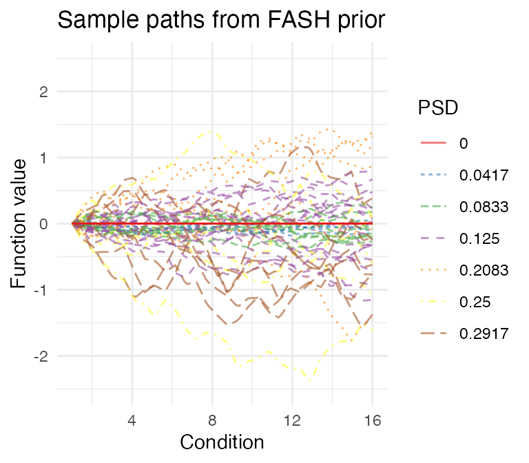
visualize_fash_prior(fash_fit1, constraints = "orthogonal") +
  scale_color_manual(values = psd_colors)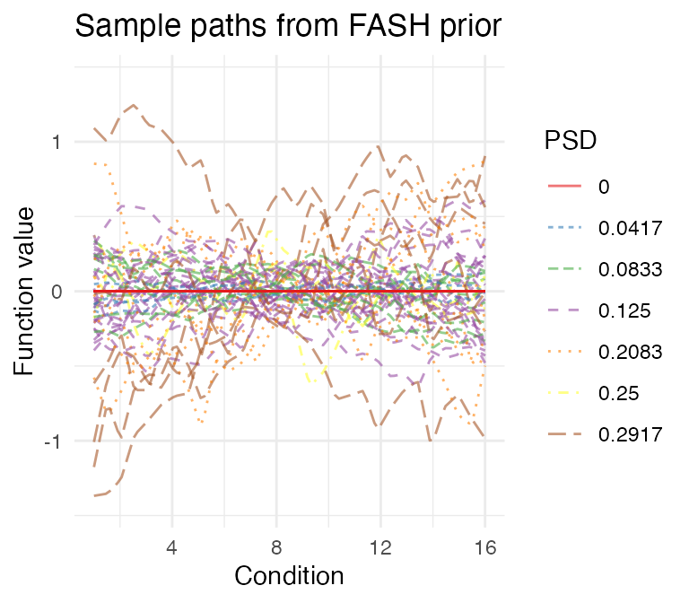
To make the inference more conservative, we could adjust the fitted FASH prior using the Bayes Factor (BF)-based adjustment:
fash_fit1_adj <- BF_update(fash_fit1)
fash_fit1_adj$prior_weights
#          psd prior_weight
# 1 0.00000000   0.60000000
# 2 0.04166667   0.04060367
# 3 0.08333333   0.05426485
# 4 0.12500000   0.15993696
# 5 0.20833333   0.04074625
# 6 0.25000000   0.03568621
# 7 0.29166667   0.06876206
Visualize the adjusted prior:
visualize_fash_prior(fash_fit1_adj, constraints = "initial") +
  scale_color_manual(values = psd_colors)
visualize_fash_prior(fash_fit1_adj, constraints = "orthogonal") +
  scale_color_manual(values = psd_colors)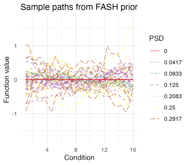
We can take a look at their posterior weights in each GP component:
plot(fash_fit1_adj, plot_type = "heatmap",
     selected_indices = c(paste0("A",1:5),
                          paste0("B",1:5),
                          paste0("C",1:5)))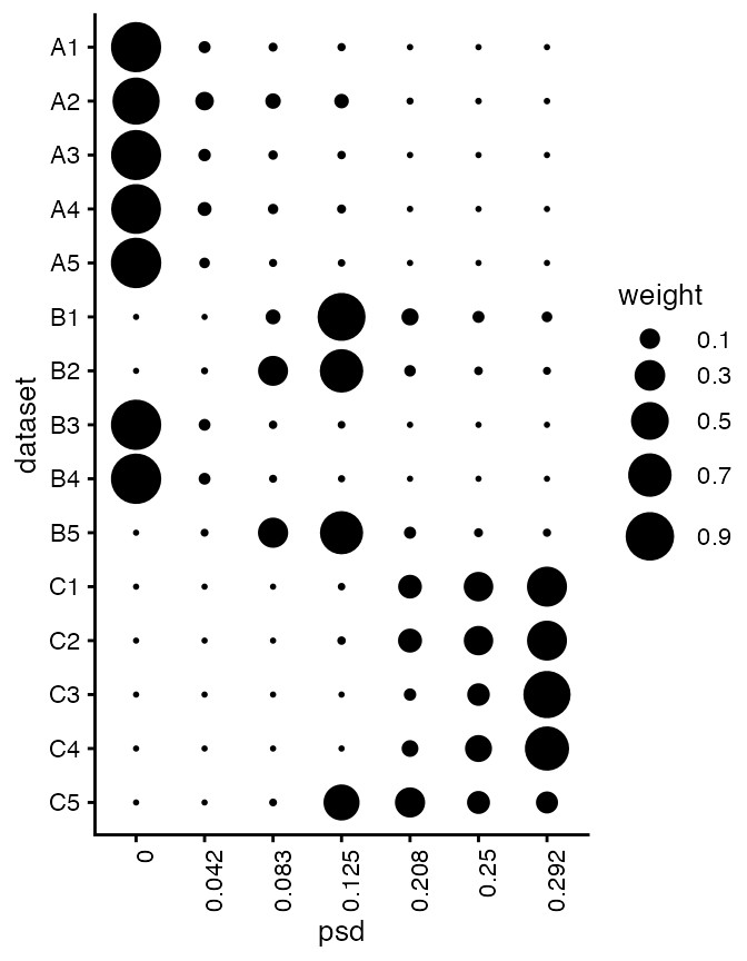
Besides the heatmap plot, we could also visualize the result using a structure plot:
plot(fash_fit1_adj, plot_type = "structure", discrete = TRUE)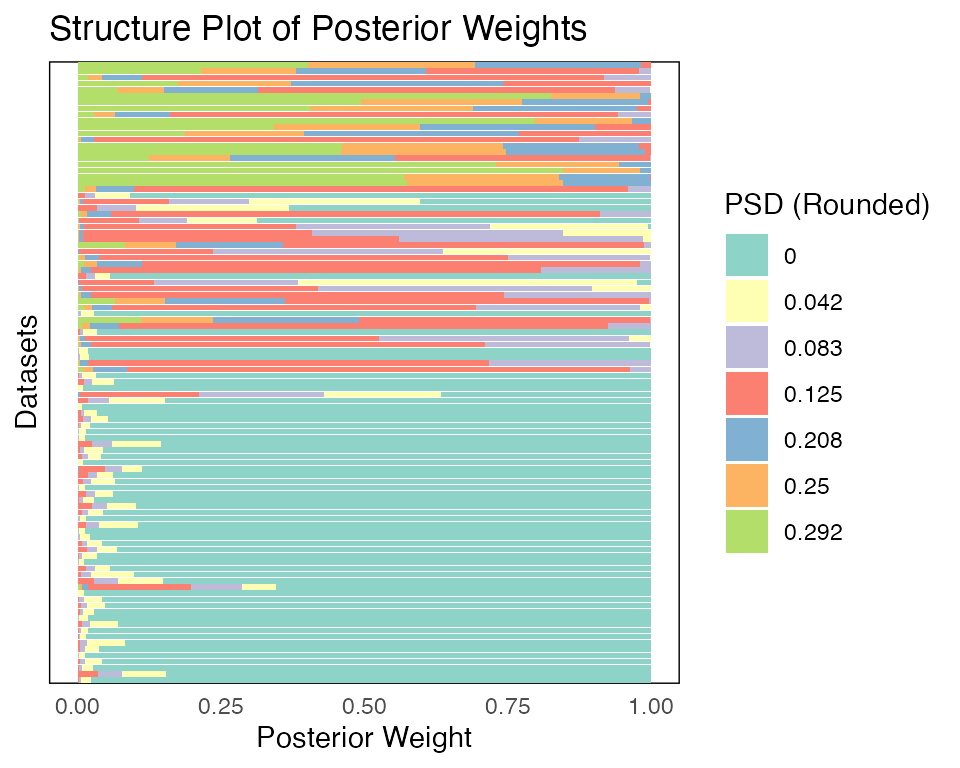
We could test
at a given FDR level (specifying alpha = 0.1):
fdr_result1_adj <- fdr_control(fash_fit1_adj, alpha = 0.1, plot = TRUE)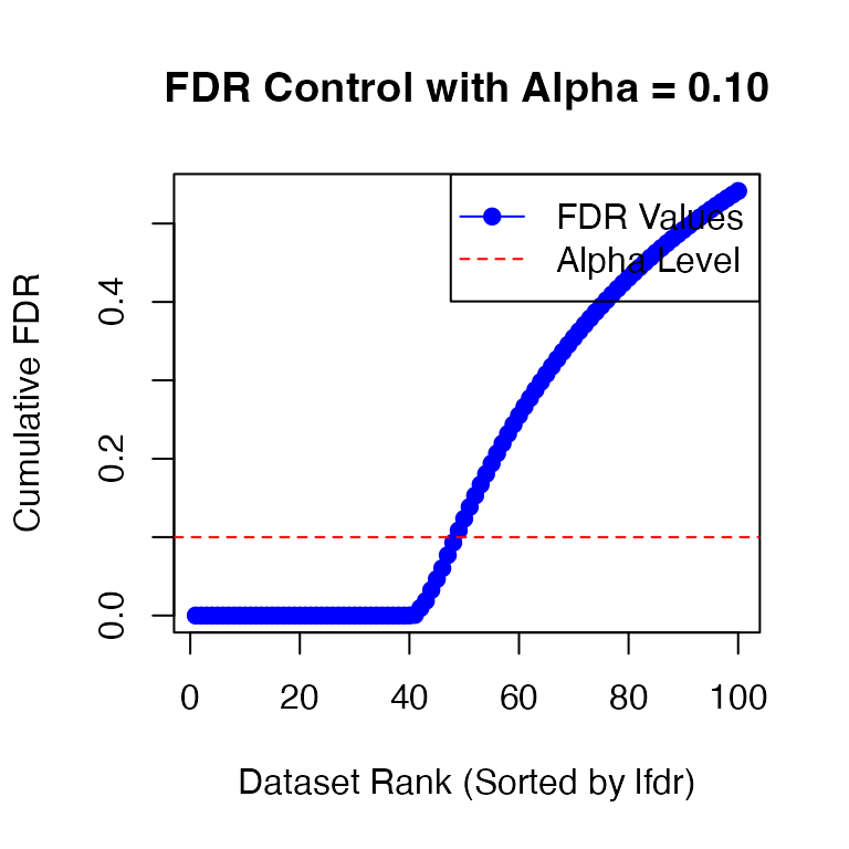
# 48 datasets are significant at alpha level 0.10. Total datasets tested: 100.However, we in general recommend using lfdr as the significance measure instead of FDR. Here we will use a threshold on lfdr of 0.01 to detect dynamic eQTLs:
This gives us 40 detected dynamic eQTLs.
The proportion of true (linear or nonlinear) dynamic eQTLs that are detected is:
sum(labels[detected_indices1] != "A")/(sizeC + sizeB)
# [1] 0.8
The empirical false discovery rate under this lfdr threshold is:
Let’s take a look at the inferred eQTL effect
for the detected eQTLs. The function predict computes the
posterior distribution of the effect size
for a given eQTL
,
and then either returns the posterior summary or posterior samples,
depending on the arguments specified.
fitted_beta <- predict(fash_fit1_adj, index = detected_indices1[1])
fitted_beta
#     x        mean      median       lower       upper
# 1   1  0.55988770  0.56075313  0.46160356  0.65671577
# 2   2  0.45829982  0.45754360  0.28194380  0.64915217
# 3   3  0.36729272  0.36739935  0.18544725  0.55236212
# 4   4  0.26960074  0.26959762  0.18218096  0.35856963
# 5   5  0.25794783  0.25727008  0.17183972  0.34457033
# 6   6  0.18698747  0.18655356  0.03620754  0.34391693
# 7   7  0.12180192  0.12041677  0.03556581  0.21275188
# 8   8  0.08532685  0.08381995 -0.04799994  0.22550677
# 9   9 -0.03538309 -0.03638632 -0.18923307  0.12510276
# 10 10 -0.16265528 -0.16228388 -0.24991525 -0.07441149
# 11 11 -0.26829249 -0.26775559 -0.35338270 -0.18245379
# 12 12 -0.38029282 -0.38044516 -0.56159438 -0.20794002
# 13 13 -0.47277480 -0.47191660 -0.67939266 -0.27006599
# 14 14 -0.53202272 -0.53462254 -0.72994826 -0.32576152
# 15 15 -0.64563084 -0.64534545 -0.84374054 -0.45185286
# 16 16 -0.69124768 -0.69155400 -0.78214008 -0.59396632
By default, predict returns the posterior information of
the effect size
for the eQTL specified by index, at each observed time
point. We can also specify the time points to predict the effect size
at:
fitted_beta_new <- predict(fash_fit1_adj, index = detected_indices1[1],
                           smooth_var = seq(0, 16, length.out = 100))
head(fitted_beta_new)
#           x      mean    median     lower     upper
# 1 0.0000000 0.5592477 0.5583612 0.4655394 0.6524803
# 2 0.1616162 0.5592477 0.5583612 0.4655394 0.6524803
# 3 0.3232323 0.5592477 0.5583612 0.4655394 0.6524803
# 4 0.4848485 0.5592477 0.5583612 0.4655394 0.6524803
# 5 0.6464646 0.5592477 0.5583612 0.4655394 0.6524803
# 6 0.8080808 0.5592477 0.5583612 0.4655394 0.6524803
It is also possible to store M posterior samples rather than the posterior summary:
fitted_beta_samples <- predict(fash_fit1_adj, index = detected_indices1[1],
                               smooth_var = seq(0, 16, length.out = 100),
                               only.samples = TRUE, M = 50)
str(fitted_beta_samples)
#  num [1:100, 1:50] 0.648 0.648 0.648 0.648 0.648 ...
Using these results we can visualize, for example, the posterior mean effect estimate:
plot(fitted_beta_new$x,fitted_beta_new$mean,type = "l",lwd = 2,
     xlab = "condition",ylab = "function value")
One can generate a more detailed figure of the posterior simply
through plot and specify
plot_type = "function". By default, the figure shows the
posterior mean effect (solid line) along with 95% credible bands (shaded
area), as well as the raw data points as black dots together with their
(+-2) standard errors (black error bars). As a comparison, we add the
true effect (that is, the effect used to simulate the data) to the
figure as a dashed line.
plot(fash_fit1_adj, selected_unit = detected_indices1[1],
     plot_type = "function")
lines(datasets[[detected_indices1[1]]]$x, datasets[[detected_indices1[1]]]$truef,
      col = "black", lwd = 1, lty = "dashed")
We might also be interested in testing whether
for some
functional
.
For example, we might be interested in detecting dynamic eQTLs whose
maximum effect in the first 8 days is larger than their maximum effect
in the last 8 days, so
.
For this type of problem, we could compute the local false sign rate
(lfsr) for each eQTL
using the function testing_functional():
evaluations <- seq(1, 16, length.out = 100)
functional_F <- function(x){
  max_first_half <- max(x[evaluations <= 8])
  max_second_half <- max(x[evaluations > 8])
  return(max_first_half - max_second_half)
}
lfsr_result <- testing_functional(
  functional = functional_F,
  fash = fash_fit1_adj,
  indices = 1:100,
  smooth_var = evaluations
)
Visualize the lfsr:
par(mfrow = c(1,3))
lfsr_result <- lfsr_result[order(lfsr_result$indices),]
hist(lfsr_result[indices_A,"lfsr"],n = 16,main = "A",xlab = "lfsr")
hist(lfsr_result[indices_B,"lfsr"],n = 16,main = "B",xlab = "lfsr")
hist(lfsr_result[indices_C,"lfsr"],n = 16,main = "C",xlab = "lfsr")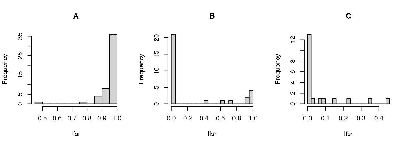
We can also use this approach for other types of hypothesis
testing.
For example, we could examine how many eQTLs show a significant switch
of sign:
We then compute the local false sign rate (lfsr) as
Here, and . An eQTL belongs to this category if its maximal difference in effect size across the full genotype dosage range (from 0 to 2) is at least 1.
functional_switch <- function(x){
  x_pos <- x[x > 0]
  x_neg <- x[x < 0]
  if(length(x_pos) == 0 || length(x_neg) == 0){
    return(0)
  }
  min(max(abs(x_pos)), max(abs(x_neg))) - 0.25
}
lfsr_switch <- testing_functional(
  functional = functional_switch,
  fash = fash_fit1_adj,
  indices = 1:100,
  lfsr_cal = function(x) mean(x <= 0),
  smooth_var = evaluations
)
Visualize the lfsr:
par(mfrow = c(1,3))
lfsr_switch <- lfsr_switch[order(lfsr_switch$indices),]
hist(lfsr_switch[indices_A,"lfsr"],n = 16,main = "A",xlab = "lfsr")
hist(lfsr_switch[indices_B,"lfsr"],n = 16,main = "B",xlab = "lfsr")
hist(lfsr_switch[indices_C,"lfsr"],n = 16,main = "C",xlab = "lfsr")
An example of an eQTL detected to have a significant switch of sign at lfsr < 0.01:
par(mfrow = c(1,1))
detected_switch <- lfsr_switch$indices[lfsr_switch$lfsr < 0.01]
plot(fash_fit1_adj, selected_unit = detected_switch[1],
     plot_type = "function")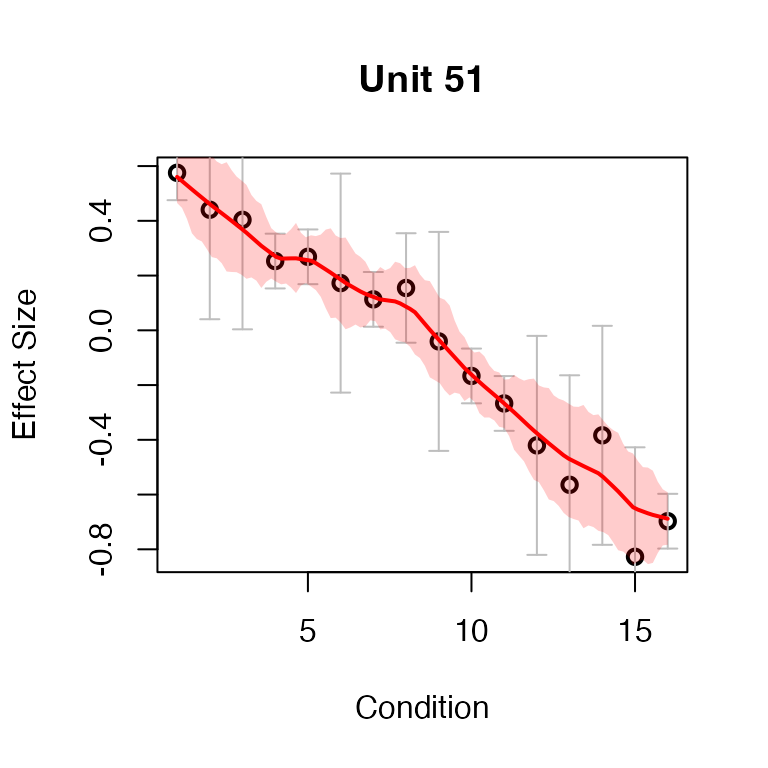
Testing Nonlinear Dynamic eQTLs
Next, we aim to detect dynamic eQTLs with nonlinear dynamics (Category C).
In this case, we specify the base model
as the space of linear functions. Therefore, we choose
,
which is a second-order differential operator. This choice corresponds
to the second Integrated Wiener Process (IWP2) model
(order = 2).
fash_fit2 <- fash(Y = "y", smooth_var = "x", S = "sd", data_list = datasets, order = 2)Again, to encourage more conservative inference, we recommend applying the BF-based adjustment to the fitted FASH prior:
fash_fit2_adj <- BF_update(fash_fit2)Visualize the prior before and after adjustment:
visualize_fash_prior(fash_fit2, constraints = "initial")
visualize_fash_prior(fash_fit2_adj, constraints = "initial")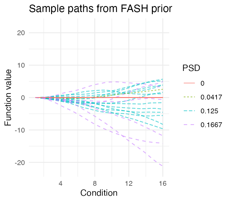
We will apply the same lfdr threshold to detect nonlinear dynamic eQTLs:
detected_indices2 <- which(fash_fit2_adj$lfdr < 0.01)The proportion of true nonlinear dynamic eQTLs that are detected is:
sum(labels[detected_indices2] == "C")/sizeC
# [1] 0.75
The empirical false discovery rate among the detected eQTLs is:
Visualize the posterior of the first detected nonlinear dynamic eQTL. The true effect is shown as a dashed line.
selected_index <- detected_indices2[1]
plot(fash_fit2_adj, selected_unit = selected_index, plot_type = "function")
lines(datasets[[selected_index]]$x, datasets[[selected_index]]$truef,
      col = "black", lwd = 1, lty = "dashed")